
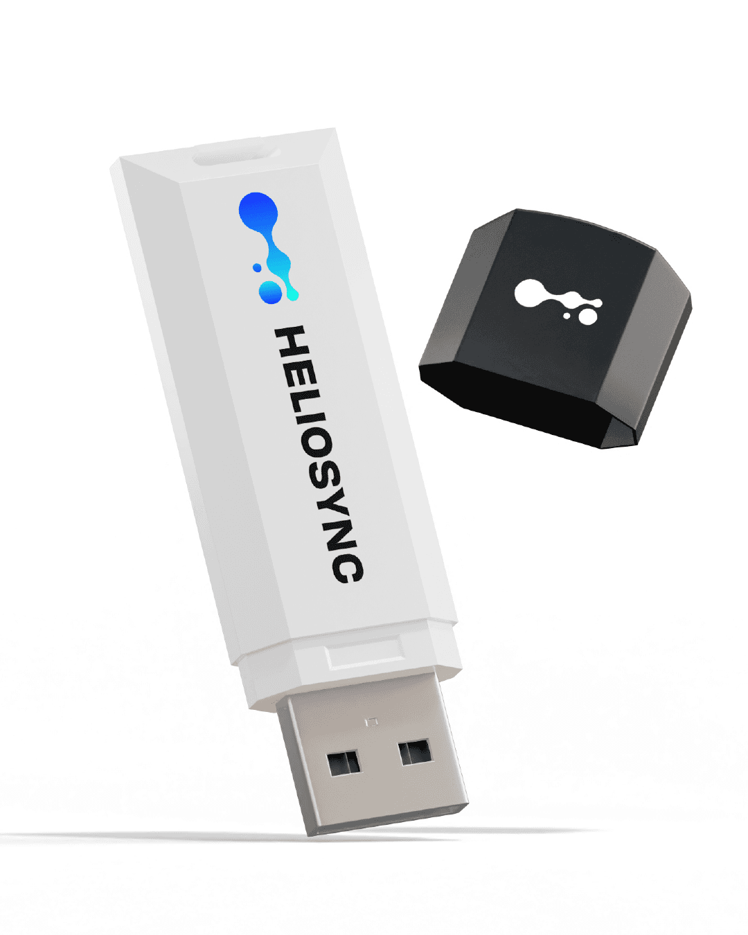
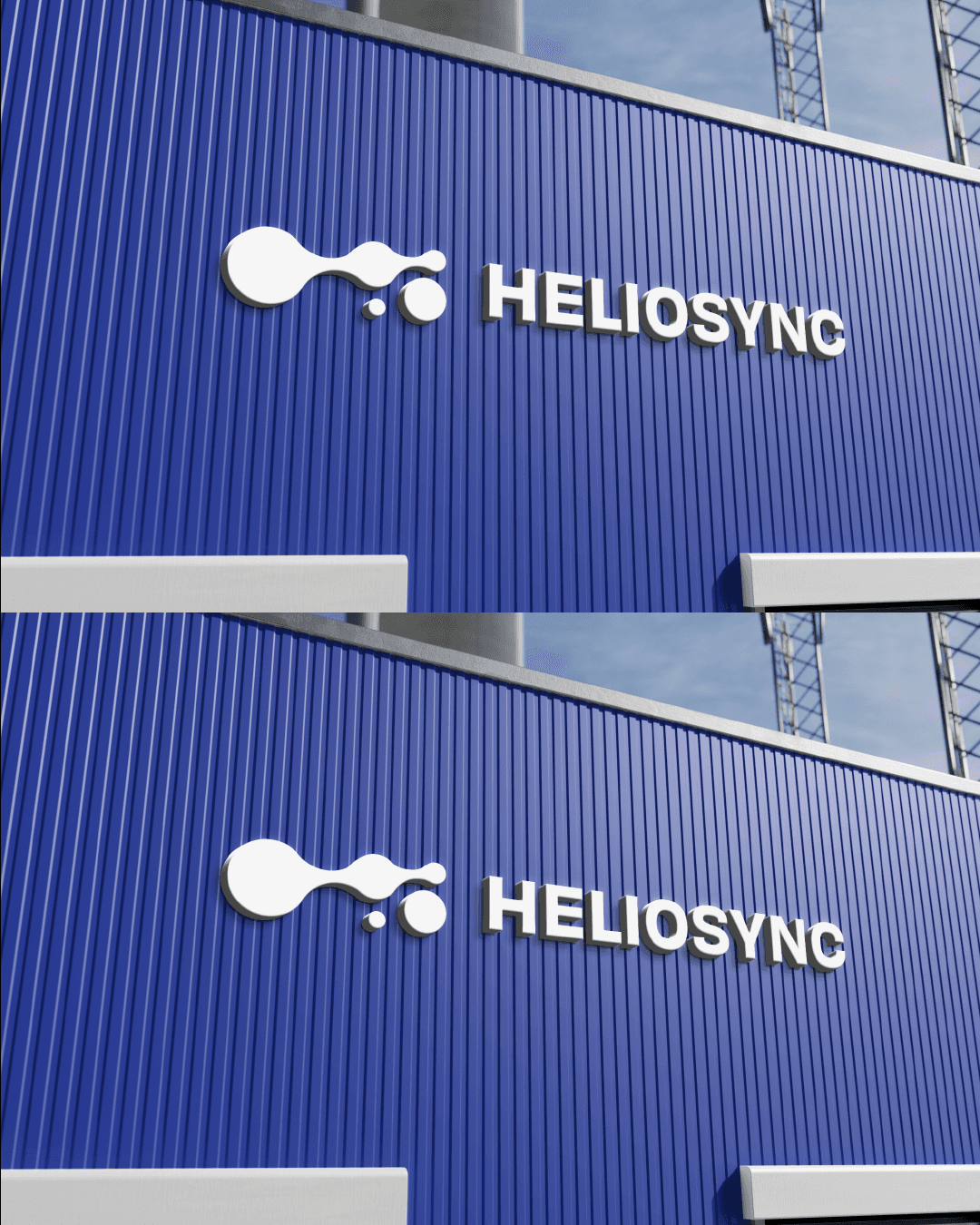
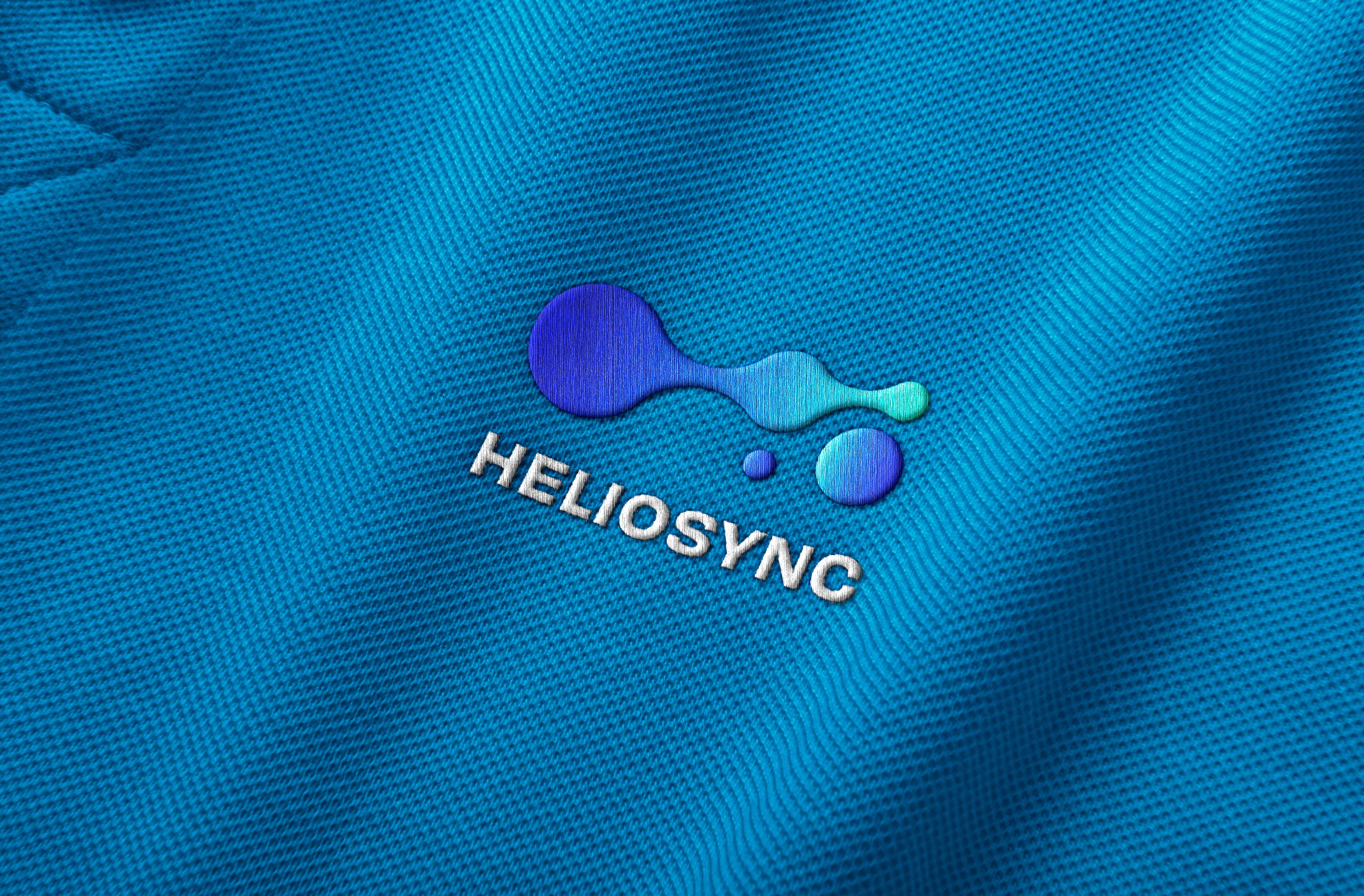
HELIOSYNC
The circular shapes and flowing design symbolize synchronized data and energy, while the blue-green gradient reflects endless possibilities in future technology.
Year
2022
Client
HELIOSYNC CO., LTD.
Service
Branding
Location
Thailand

This proposal draws inspiration from the first character "大" (meaning "great") in [Great China Development Corporation], embodying the company’s grand and ambitious brand image. The design extends the square structure outward from its base, symbolizing rooted growth and a forward-looking vision dedicated to urban renewal and excellence.

English